

Fall decorating shouldn't feel like the house changed into a costume. Nobody needs pumpkins on every surface or a room done up in orange. What you want is a small shift in mood, so the rooms feel warmer and a little more closed-in as the evenings get shorter.
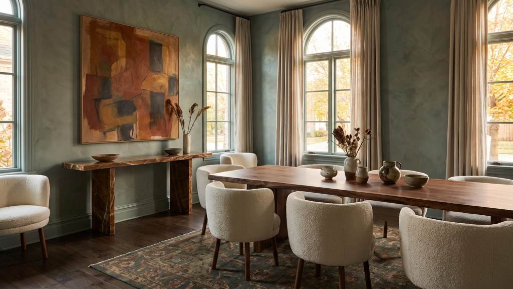
This year the better interiors are using more color, and using it with more nerve. The pale, say-nothing room is on its way out. In its place we're seeing smoky greens, wine reds, browns with some complexity to them, and neutrals that look like they came out of a quarry. These colors have presence but they don't shout, and they sit well next to stone, good wood, handwoven textiles and art.
Autumn colors, one step removed
The palette starts in nature but rarely takes the obvious version. Forest green turns into smoky jade. Bright red goes darker, to oxblood or garnet. Orange becomes burnt sienna, rust or aged cognac. Beige picks up depth as mushroom, flax, putty or limestone.
Chocolate brown is back too. We'd pick it over black almost every time. In a library, dining room or primary suite it wraps the room and makes the architecture stand out, whether it's on plaster walls, high-gloss cabinets or mohair upholstery. And it gets along with cream, pale blue, antique brass, travertine and almost any wood. No surprise, then, that it keeps turning up in the paint houses' colors of the year.
Ochre is the easy way to add warmth without committing a whole room to it. Try it in a hand-knotted rug, a pair of lounge chairs, a lacquered drinks table or the silk lining of the drapery. Terracotta works best when it looks like sun-baked clay. Once it drifts toward bright orange it loses the point. We like it with limestone, unlacquered brass and dark oak.
Start with the house itself
Color works best when it answers the architecture. A lakefront house with big windows can take tones that pick up the water, the trees and the sky. A contemporary city apartment can handle saturated color used in a more graphic way. In an older house, earthy, slightly aged pigments help the original millwork, plaster and stone look like they belong.
Before you choose anything, watch how light moves through the rooms over a full day. A deep green that looks balanced in a sunny south-facing room can go nearly black facing north. Warm bulbs push red undertones forward and cool ones flatten them. Paint big samples on boards you can carry around (not on the wall) and look at them next to the floor, the fabrics and the art, in daylight and again at night.
Then there's the view. Inside color should frame what's outside the window. It shouldn't fight it. In wooded settings, muted greens and warm neutrals carry the outdoors in. In coastal or mountain homes, ochre, iron, clay and stormy blue help the house feel like it grew there.
Color-drenching, done with finishes
Color-drenching is one color on the walls, the trim, the doors and sometimes the ceiling too. It's been around for a few years now and it still works. Our favorite way to do it is to change the sheen as you go: matte plaster on the walls, satin on the trim, high-gloss on the doors. Same hue everywhere, but each surface catches the light a little differently.
It's strongest in rooms meant to feel private and wrapped up, like libraries, screening rooms, cocktail lounges, powder rooms and dressing rooms. Deep aubergine, olive, tobacco and midnight blue turn these into little jewel boxes. Even a hallway gets interesting when you paint it as a room instead of a way to get somewhere else.
Open rooms are different. There, a soft warm ivory or mushroom on the walls usually works better, and the furniture and art do the heavy lifting. Aim for contrast that looks intended. Pale Venetian plaster against oxblood velvet works. So does honed limestone beside lacquered walnut, or creamy bouclé on a handwoven rug in forest and rust.
Texture counts as color
You can't separate color from material. The same brown reads differently in suede, walnut, stone and gloss lacquer, and fall is a good time to bring in surfaces that soak up light or bounce it around.
Mohair, cashmere, alpaca, velvet and brushed wool look warm before they feel warm. You may only need a few pieces. A cashmere throw on the chaise, velvet cushions on a linen sofa, a wool rug layered under the seating you already have. At the windows, add heavier side panels and keep the sheers for filtered daytime light.
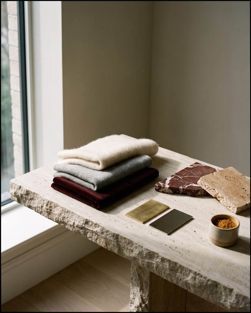
Stone is color too. Rosso marble, heavily veined quartzite, brown onyx and warm travertine won't fade, and every slab is a little different. We'd put them on a fireplace surround, a cocktail table, a console or a bar top, where the pattern gets looked at. And as our cost guides show, the step up from a good slab to a remarkable one is usually money well spent.
Metals should look chosen. Unlacquered brass and bronze pick up character as they age, and polished nickel gives you a cooler counterpoint to all that warmth. Don't match every metal in the room. Mixed finishes that look collected over time are more convincing.
A seasonal change without redecorating
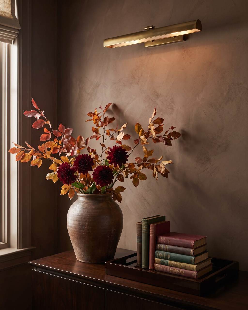
Most of the time you don't need new furniture at all. Start by taking things away, meaning the few objects that still say July. Then add some darker pieces that would look right in any month. Hand-thrown earthenware where the pale ceramic vase used to be. Velvet or wool cushions in place of the light ones. A dark tray, a single sculptural branch, a stack of books with deep-colored spines.
Lighting changes the mood as much as paint does. As fall comes on, check the color temperature and placement of every lamp in the house. Low pools of warm light make seating areas inviting and pick up the texture of plaster, fabric and wood. Picture lights, hidden shelf lighting and dimmable sconces fix rooms that go flat after sunset.
Flowers are where people overdo it. A few turning branches, some burgundy dahlias or chocolate cosmos, or a handful of seed pods will say more than a big seasonal arrangement. Put one of them in a heavy vessel and stop there. We'd use the same rule on the autumn table.
Buy for February, too
Don't let one season, or one trend, run the house. The fall changes we like best make you notice something the house already does well. Fresh paint on old paneling, say, or a hand-knotted rug that finally ties together furniture that never matched. Custom drapery is underrated here. It helps with sound, privacy and the proportions of a window, and it looks good.
Before you commission anything big, picture the palette in February, May and July. The colors that last are usually the complicated ones, the kind that look a little different at noon than they do at dusk. Obvious trend shades wear out faster. Natural materials age better for a similar reason (the variation and patina are the appeal), which is a thread running through the wider 2026 trend picture.
If we had to pick one move this fall, it would be the lamps. Warmer bulbs, lower pools of light and a dimmer in the room you use most will change every color already in the house.