
The Luxury Hôm style guide
The system behind every template — a navy-led palette, a print-magazine type pairing, and a live component library. Luxury Lives Here.
A navy-led, materially quiet palette
Deep navy carries authority and never competes with photography. Lighter blues are the only accent; whites and greys do the structural work. No saturated, “salesy” colour appears anywhere in the system.
Navy — structure & headlines
Blue — accent & interaction
Neutrals — surfaces & rules
Fraunces + Libre Franklin
Luxury Lives Here
Aa Bb Cc Dd Ee
A high-contrast serif for headlines and pull quotes.
A clean, highly legible grotesque for body copy and navigation. It carries long-form reading comfortably at 1.135rem with a 1.75 line height, and holds up in the interface at small sizes.
Cinematic, full-bleed, editorial
- Full-bleed & confident
Photography leads. Heroes run edge-to-edge with a navy gradient scrim so white headline type stays legible.
- Warm, natural light
Prefer daylight and material texture over staged, over-lit interiors — closer to Robb Report than a property portal.
- Consistent ratios
Editorial 16/9 and 16/10, cards 4/3, product portraits 3/4, galleries alternate 16/9 and 4/5.
- CDN-optimised
Every image is served responsive via the Netlify Image CDN (AVIF/WebP), lazy-loaded below the fold, with reserved space for zero CLS.
- Pinterest-ready
Vertical 3/4 crops and descriptive alt text on every asset for visual-search discovery.
- Descriptive alt text
Alt text describes the room and materials, never “image” — for accessibility and image SEO.
The live component library
Listing card
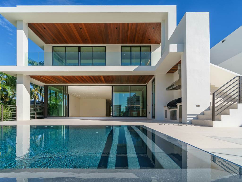
Real estate. Status flag, price-led, spec strip — unmistakably a home.
Product / brand card
Furnishings. Portrait crop, category tag over the piece name.

Connery Sofa
Editorial article card
The default content unit — pillar-tagged so readers always know the content type.

Author byline (E-E-A-T)
Photo, credentials, publish + updated dates, read time.

Breadcrumbs
With BreadcrumbList structured data on every template.